Brand Guidelines
Our brand guidelines are carefully crafted to reflect our identity and what we as a company stand for.
Primary Logo
Webkul logo is a result of constant incremental improvements and reflects our ever-improving culture, products, and services
Square Logo
The monogram of the webkul logo is only to be used in square spaces. Be careful while using the monogram, only use it when Webkul brand is already established and the user is very familiar with Webkul. That includes webkul events, office, stationery, and merchandise.
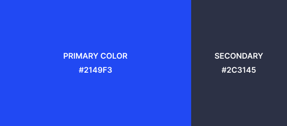
Colors
Webkul brand color pallet is what gives a distinct identity to the brand. The colors beings used across our digital presence, from websites to social media.
Clear Space
Webkul logo looks best when it has enough breathing space around it.

Mistakes to avoid

Don’t use logo with busy backgrounds for the sake of readablity

Don’t use logo with low contrast backgrounds
Don’t use old logo of Webkul

Don’t use wordmark alone.

Don’t create own version

Don’t change the color of webkul logo.
Layouts
Picca
Consistent branding help users to recognize and trust the brand. We designed “Picca” to create a more recognizable Webkul experience for 80,000+ customer base. Read More

Usage of Picca

Anatomy of Picca
Picca is composed of two minimal geometric forms, the larger at the top left and the smaller at the bottom right.
We are an agile team, and n number of designers can work on the same thing. So, we drafted documentation for Picca usage to avoid any visual pitfalls and maintain consistency. Picca is the genesis of the future of Webkul brand identity and design. It will lay in the foundation for our brand to create a memorable experience for our users.
